Font Guide · Published · Updated August 2026
Name Necklace Fonts
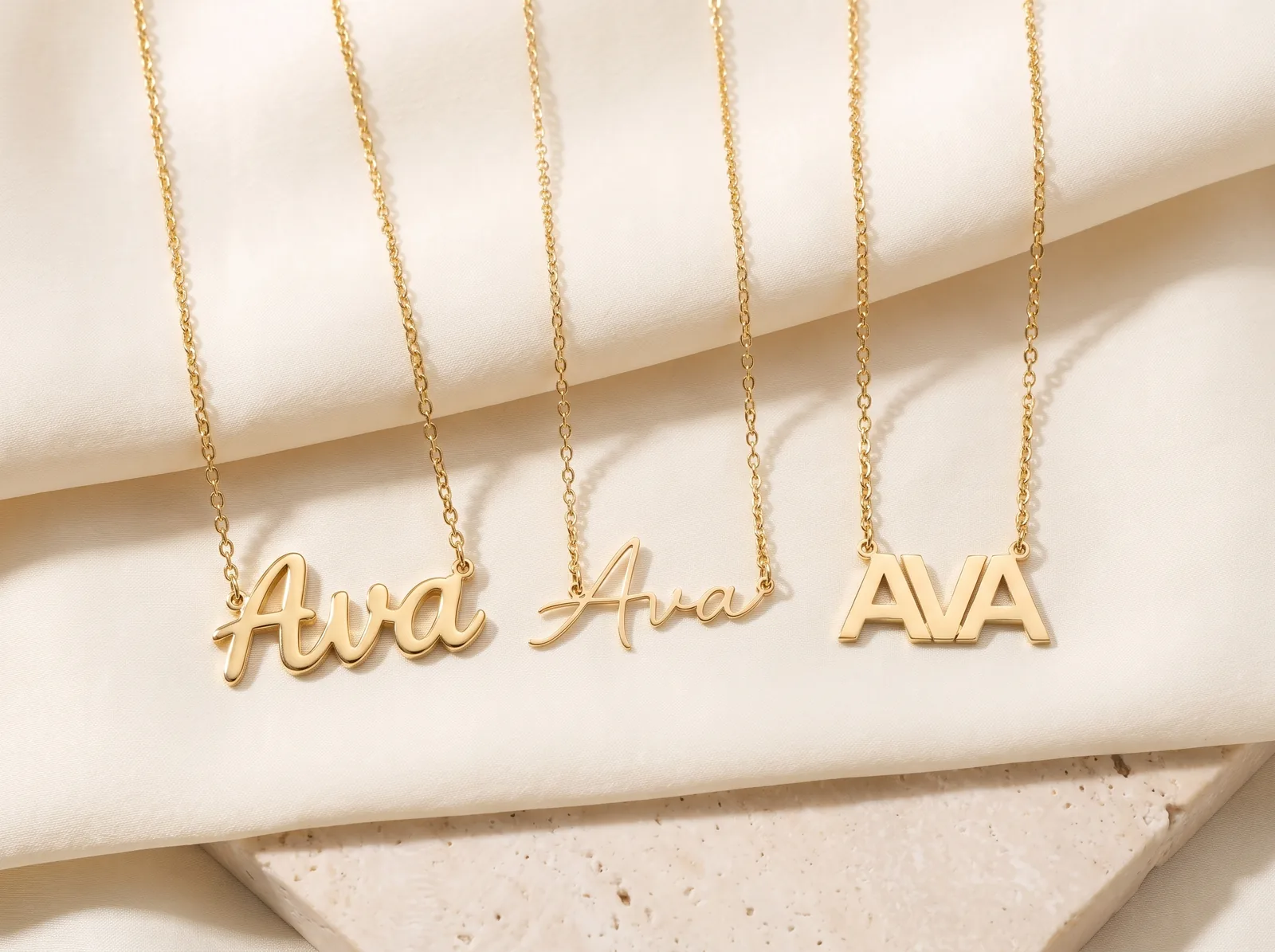
A name necklace font is the letter shape your name is cut in. Almost every piece uses one of three: script, cursive or block.
Script joins the letters together. Cursive is that same joined hand, drawn much thinner. Block uses capital letters, each one standing on its own.
The font is not only a look. It sets how strong the piece is and how a long name sits. It sets how thin the letters can go, and what chain suits them. This guide takes the three one at a time.
What font should a name necklace be in?
Pick the font by how long your name is and how much you will wear the piece. A short name wears well in any of the three. A long one, or a piece you never take off, narrows the choice fast.
Type is sorted into families by the shape of its letters, and a typeface classification guide puts joined handwriting in one family. Upright block capitals sit in another. That split matters more on a nameplate than it does on a page, because the whole name is cut from one flat sheet.
Joined letters hold each other up. Separate letters do not.
Here are the three in one line each:
- Script. Letters joined by thick strokes. The joins hold a long name in place. The strongest look for a name of any length.
- Cursive. The same joined shapes, drawn much finer. Light to wear, and best on a short name. This is the most dainty of the three.
- Block. Capital letters, each one on its own, thick and even. The easiest to read, and the hardest to bend.
Every font here is cut to order, so the name is what decides the shape, not a stock size. You can see all three on real pieces across our custom name necklaces. The same letterforms turn up on name pendants, cut smaller.
One more thing this page is not about. A whole name and a single letter are cut differently, and they are different pieces. If you want one letter rather than a name, start with initial necklaces instead.
Script name necklaces
A script name necklace joins the letters together, and those joins are what hold a long name in place. It is the look most people picture. One flowing line, cut as one piece.
Look at where the metal is. In script, the stroke leaving one letter runs straight into the next. There is no gap to bridge.
A row of letters becomes one solid bar of gold with a name cut out of it. A bar is hard to bend.
Script strokes also change thickness as they curve. The downstrokes are the thick ones, and they carry most of the load. So a script piece can look delicate and still be tough.
The thin parts are short. The thick parts do the work.
Two things to know before you choose it. Script runs longer than block for the same name, because the joins add width between the letters. Capital letters in script also have loops and tails.
The first letter usually sits taller and wider than the rest. On a short name that is a nice flourish. On a long one, see it at size first.
Cursive name necklaces
A cursive name necklace is the same joined hand as script, drawn much thinner. Same letter shapes, same joins, far less metal. It is light to wear and it works best on a short name.
Joining is what the word means. Merriam-Webster defines cursive as writing with the strokes of the letters joined together and the angles rounded. Script is joined too.
In jewelry the two words split by weight instead. Script is the bold cut. Cursive is the fine one.
Thin is the whole point, and it is also the whole trade. Less metal means a piece you stop noticing on your neck. That is what people mean by a dainty name necklace. It also means the finest strokes on this page, so cursive asks for a little more care than the other two.
Cursive holds up better at small sizes than you would expect. The joins never leave a letter standing alone. Shrink block capitals and each one gets thinner by itself. Shrink cursive and the letters keep leaning on each other.
Where it struggles is length. A long name in cursive is a long, thin shape. A long thin shape flexes more in the middle than at the ends. Past about seven or eight letters, script gives you the same look with more metal behind it.
Block letter nameplates
A block letter nameplate uses capital letters, each one on its own, thick and even. It is the strongest of the three and the easiest to read across a room.
Block letters have no joins, so each one has to carry itself. That is why they are cut thick. Nothing on the piece is much thinner than anything else. Even thickness is what makes a shape hard to bend.
Even thickness is also why block reads so cleanly. Every stroke is the same weight, and the letters sit apart with a clear gap. Nothing runs into anything else. A name in block reads at arm’s length, in a photo, and at small sizes.
Block is also the most compact. Capitals with no joins take less width than script at the same letter height. So a long name in block sits shorter across the collarbone. If you want a long name to sit neatly, look here first.

Long names, and two names
The longer the name, the more the font matters — and two names are the longest case of all. A short name is short enough that all three fonts behave. Past about seven or eight letters they stop behaving the same way.
Length works against a nameplate in one particular way. A pendant is held at two points, one at each end, and everything between them is unsupported. Make that span longer without making the letters thicker and the middle becomes the weak spot.
Each font answers that differently:
- Script adds a join at every letter, so a long name arrives as one continuous line. This is the safest long-name font.
- Block answers with thickness instead of joins. It also takes less width per letter, so the span is shorter to begin with.
- Cursive has the joins but not the metal. It is the one that gets long and light at the same time.
A two name necklace holds two names in one piece, and we join them so both look even. That is the real work in a two-name design. Two names are almost never the same length.
So the letter height and the spacing are set for the pair, not for each name alone. Get that wrong and the shorter name looks like an afterthought. Pieces with two names are quoted one at a time rather than picked from a list.

Letter thickness and chain length
Two numbers follow from the font: how thick the letters are cut, and how long the chain is. Neither is a free choice. Both follow the shape you picked.
Thickness first, because it is the one you cannot see in a photograph:
- Letter thickness — typically 1.0–1.2mm; substantial without being bulky.
That is the depth of the metal, not the width of the strokes. It is what stops a nameplate feeling like foil. The stroke width is the part the font sets.
Script and block are cut wide, cursive is cut fine. All three sit in the same thickness range.
Chain length is the other one, and the rule is about weight, not taste. A fine cursive piece belongs on a fine chain. A heavy chain beside fine letters only makes them look thinner. A thick block plate can carry a heavier chain without looking outmatched.
Length matters too, and it is mostly about width. A long name in any font is a wide piece, and a wide piece needs somewhere flat to sit. Shorter chains hold it high on the neck, where the body curves most. Longer ones drop it lower, where there is more flat room — and leave space to layer a chain above it.
Fonts in gold and in sterling silver
The metal does not change the shape of the letters. It changes how fine they can go, and how much care they want. The letterform is the first choice. The metal follows it.
A gold nameplate necklace can be cut in any of the three fonts, and the gold color is a separate decision from the letterform. Yellow gold is the warmest of the three golds. White gold is the coolest, and rose gold sits between them.
At the same karat all three hold the same gold, so color is only a matter of looks. You can compare gold colors if that is the choice you are stuck on.
What karat does change is hardness. More gold means a softer metal. So a lower karat holds a fine cursive stroke a little better than a higher one. That is a real difference on thin letters and barely one on thick letters.
Sterling silver still holds small, fine letters well, which is why it suits cursive. It does ask for more upkeep, and the reason is chemistry rather than quality. The Royal Society of Chemistry describes silver as a soft metal that tarnishes slowly in air as sulfur compounds react with its surface.
So a silver piece needs a polish now and then, and a gold one does not. Being softer, silver also marks more easily. On thin letters, that is worth knowing first.
Frequently Asked Questions
Related guides & collections
- Monogram vs nameplateA name cut as one plate, or two or three initials woven together.
- Custom name necklacesThe full collection — every font, metal and length.
- Personalized jewelryInitials, names and words, made to order.
- What is white gold?What the metal is made of, and why it needs re-plating.
- The Style collectionNecklaces, rings, bracelets and pendants in every metal.
A font reads differently at size
See Your Name in All Three
A font on a screen and the same font cut in gold are not the same thing. Length, weight and the joins all change once the name is a real one. Bring us the name and we will draw it with you. We work through font options with you at consultation, at our Snellville showroom near Atlanta.
Prefer to talk? Call (704) 684-7530